How to Color Correct and Color Grade Photos in Photoshop – Step-by-Step Guide
How to color correct and grade photos in Photoshop with our step-by-step guide. Enhance your images using professional techniques for vibrant colors and rich textures.

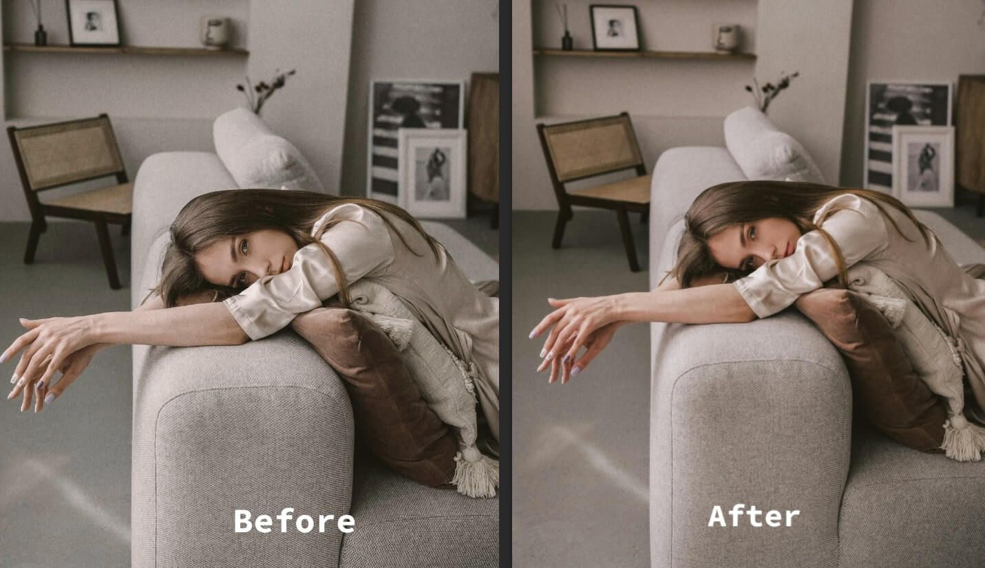
When editing in Photoshop, you may often find the colors don’t quite capture the vibrant hues and rich textures as expected. Maybe the rich reds and deep blues that caught everyone's eyes on that recent fashion photoshoot now look flat and uninspiring in the photo. This is where color correction and color grading step in.
While color correction helps fix imbalances and restore true hues, color grading adds a creative touch to enhance the overall mood. From adjusting white balance and exposure to enhancing specific color ranges, Photoshop has everything you need to make your photos look their absolute best.
Let’s walk you through how to color correct and color grade photos in Photoshop with an easy-to-follow guideline.
What is Color Correction in Photoshop?
Color correction in Photoshop is a photo editing techniques which adjust the colors in a photo to make it look more like what you saw with your own eyes.
As I already said, the colors don't always come out exactly right when you take a picture. It could be that the camera didn't get the white balance right, and things look too blue, orange, or whatever. Or maybe the picture is too light or dark, messing with the colors. There could also just be a weird color tint over the whole photo.
Mastering tools like color correction and grading in Photoshop opens doors to endless creative possibilities, including enhancing fabric textures and removing wrinkles for a polished look.
Color correction helps fix these kinds of color issues. It makes the colors look neutral and "true to life," so you have an accurate starting point if you later want to make any other changes to the photo.
Basic Photoshop Color Correction Tutorial in Photoshop
Levels Adjustment
The Levels tool is a powerful way to adjust shadows, highlights, and the tones in between in a photo. To use it:
- Go to Image > Adjustments > Levels.
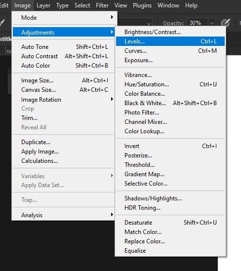
- You'll see some sliders for blacks, whites, and grays. Move these around to deepen the shadows, brighten the highlights, and adjust the midtones how you like.
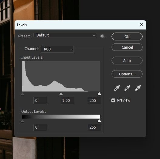
- Use the droppers to set black, gray, and white points for color balance.
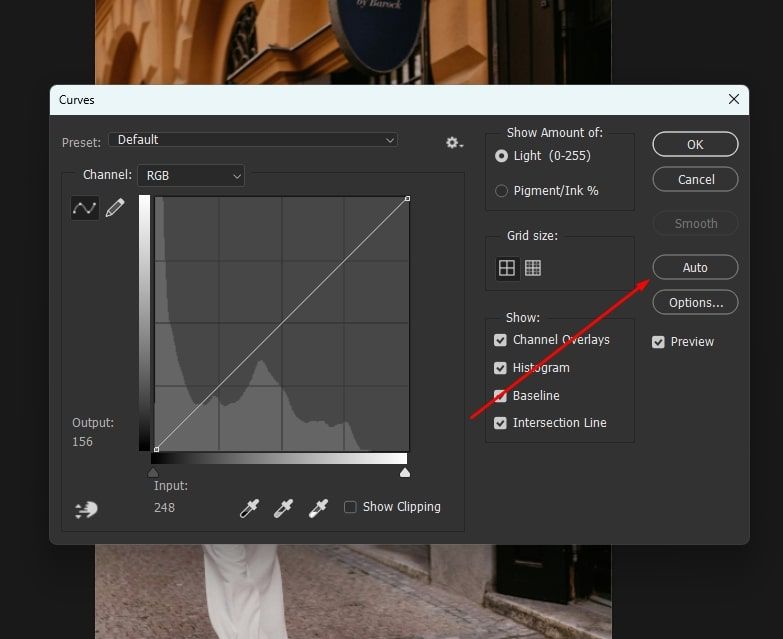
Curves Adjustment
The Curves tool lets you tweak shadows, midtones, and highlights even more than Levels. Here’s how to use it:
- Go to Image > Adjustments > Curves.
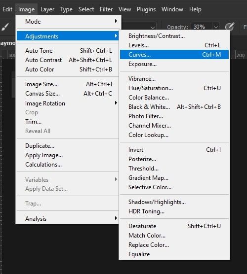
- With Curves, you'll see a line graph that represents the tones from dark to light. You can click on the line to add anchor points and drag them around to directly change the shadows, highlights, or parts in between.
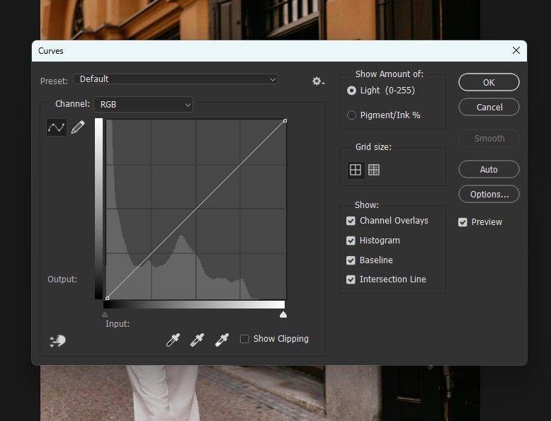
- It also lets you adjust the red, green, and blue color channels (RGB) individually. This is for when you just want to adjust one particular color, like pulling back the blues a touch.
Auto Color Correction
If you need a basic color fix but don't want to bother with manually correcting things, you can try Photoshop’s auto color correction.
Just go to Image and look for Auto Color. Upon selecting, Photoshop will analyze the photo and automatically adjust things like the white balance and exposures, and remove any unwanted tones.
It usually does a decent job with one click. But sometimes, the fixes it makes are too strong. If that happens, just lower the opacity of the corrected layer until the colors look more natural again.
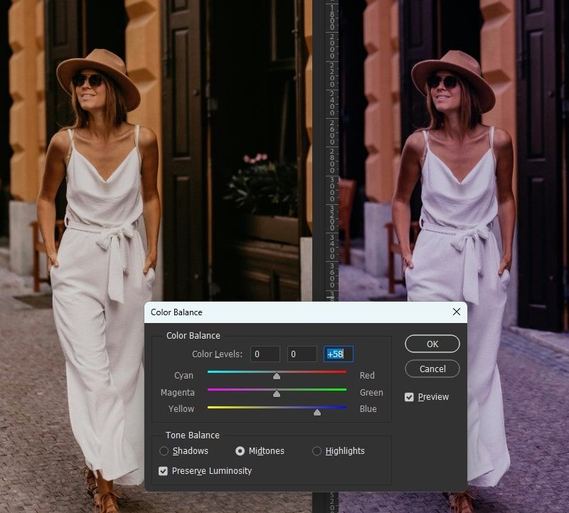
Color Balance Tool
The color balance tool lets you target exactly which colors you want to adjust in the shadows, midtones, and highlights. Here’s how you use it:
- Go to Image > Adjustments > Color Balance.
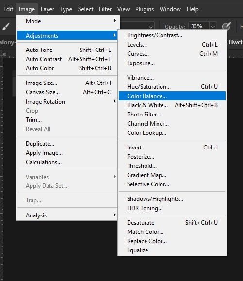
- You'll see some sliders for adding or taking away colors like cyan, magenta, yellow, reds, greens, and blues. There are sliders for the shadows, midtones, and highlights separately.
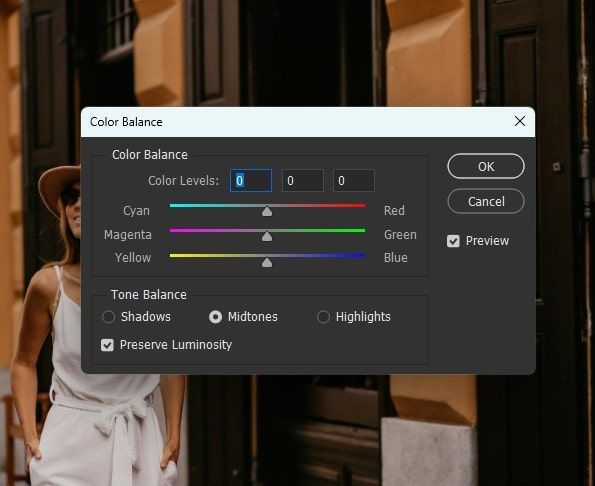
- Want to make the shadows bluer? Pull the blue slider left in the shadows section. Want to warm up the highlights a touch? Pull red to the right at the top.
Advanced Color Correction Tutorial
Camera Raw Filter
Even if your photos are JPEGs instead of RAW files, you can still get some awesome color editing controls by using the Camera Raw filter. To use it:
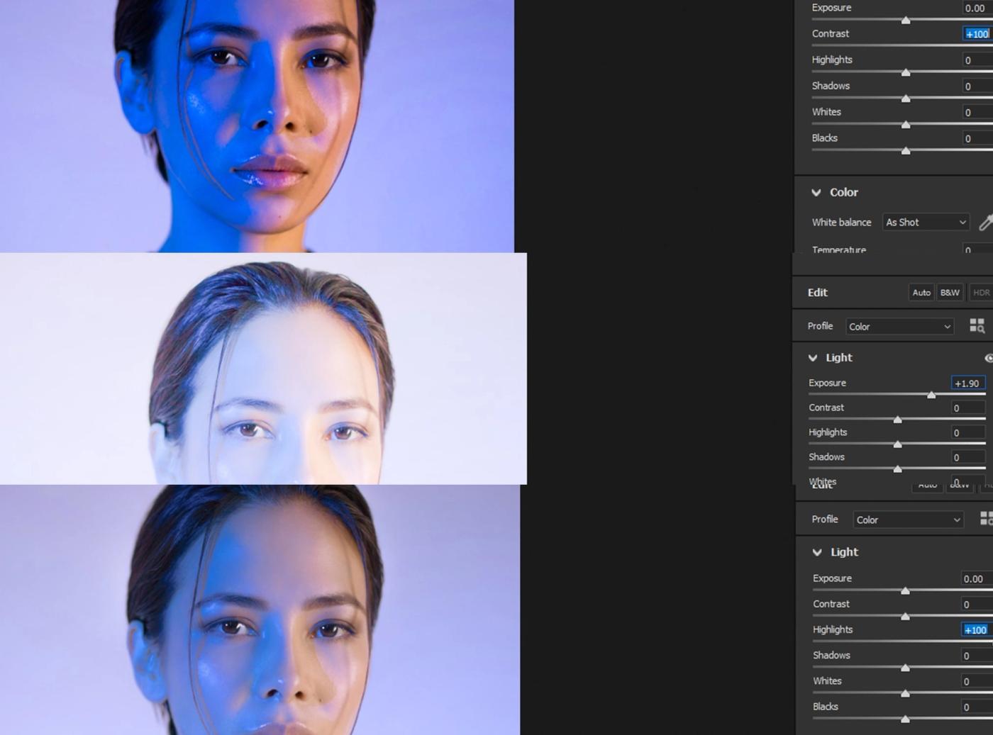
- Go to Filter > Camera Raw Filter. This opens up a panel with tons of sliders for fine-tuning your image.
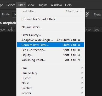
- In the Basic tab, you'll find all the usual options, such as exposure, contrast, highlights, and—most importantly—the white balance sliders.
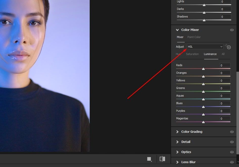
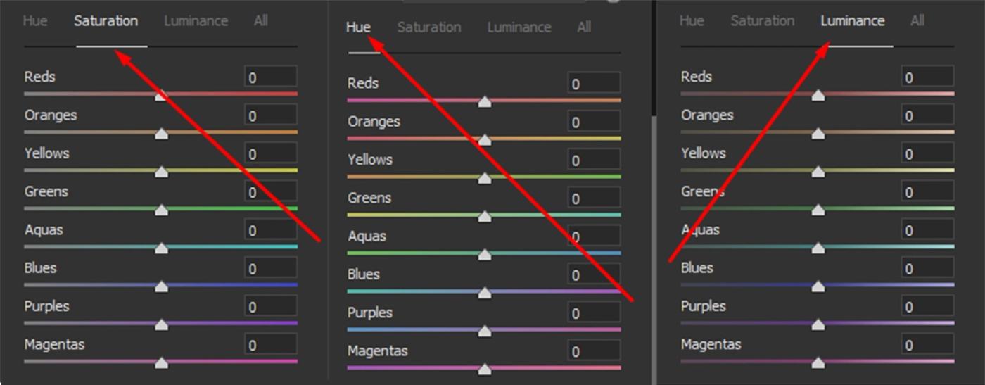
- In the HSL, you can individually adjust the hue, saturation, and lightness of every single color in the photo.
Hue/Saturation Adjustment
The Hue/Saturation tool lets you dial in the exact colors that you want to change within an image. To use it:
- Go to Image > Adjustments > Hue/Saturation.
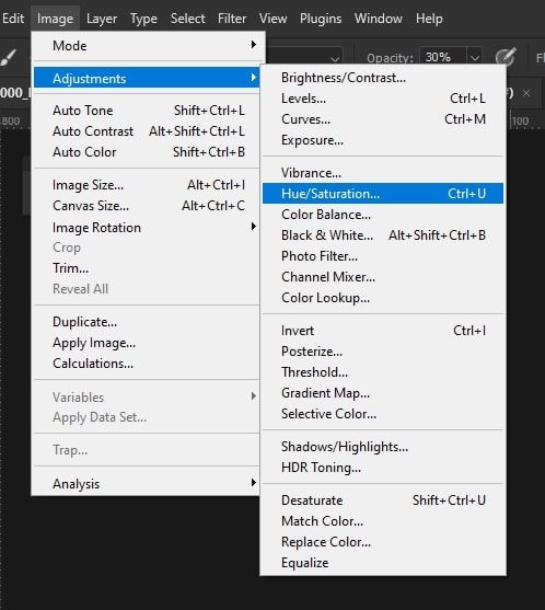
- It'll have sliders to adjust the hue (color), saturation (vibrancy), and lightness of whatever color you select from the dropdown menu above.
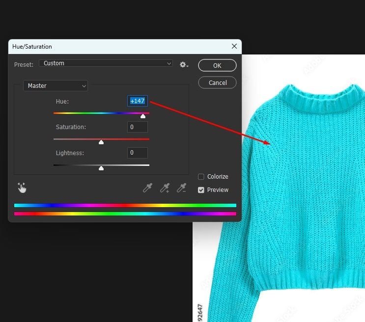
- From there, you can pick specific colors or color ranges, like reds, oranges, and yellows together. Then, just move the sliders to your liking.
Selective Color Adjustment
The Selective Color tool is for when you really need to isolate a single color and tweak it. Here’s how you use it:
- Go to Image > Adjustments > Selective Color.
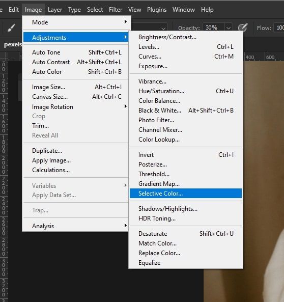
- It'll let you pick a color from the top menu.
- Those sliders control the cyan, magenta, yellow, and black inks for the color you select, so you can precisely add or subtract ink amounts.
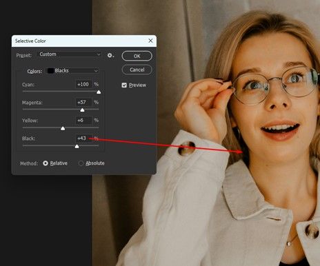
For example, to darken reds a bit, pull down the magenta slider. You can also boost yellow to make greens more vibrant.
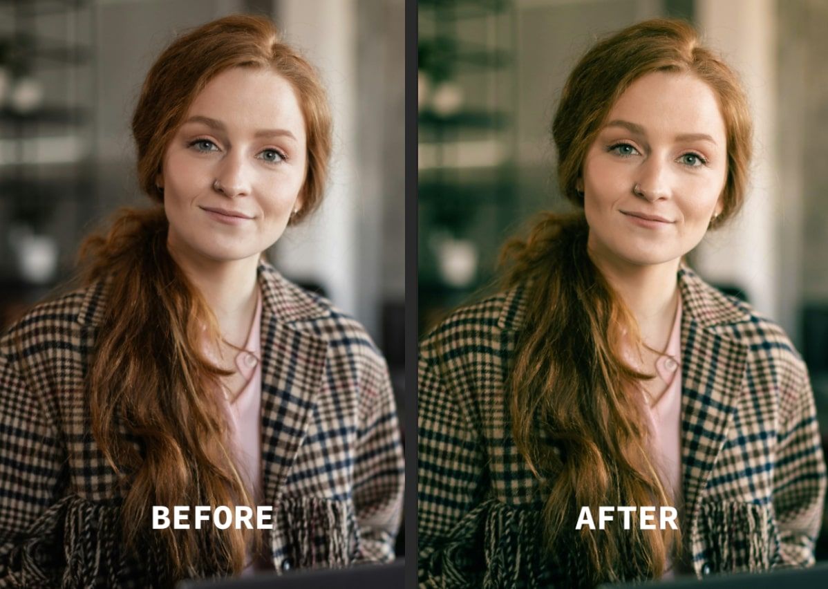
Match Color Feature
The match color tool is handy if you want two photos to have a similar look and feel. Here’s how to use it:
- Open both images you want to work with in Photoshop. Then select the one you want to adjust the colors on.
- Then, go to Image > Adjustments > Match Color.
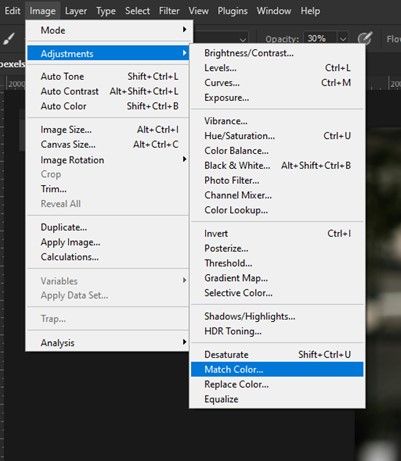
- It will ask you to select the "source" image—the one whose color scheme you want to apply. Select it from the dropdown.
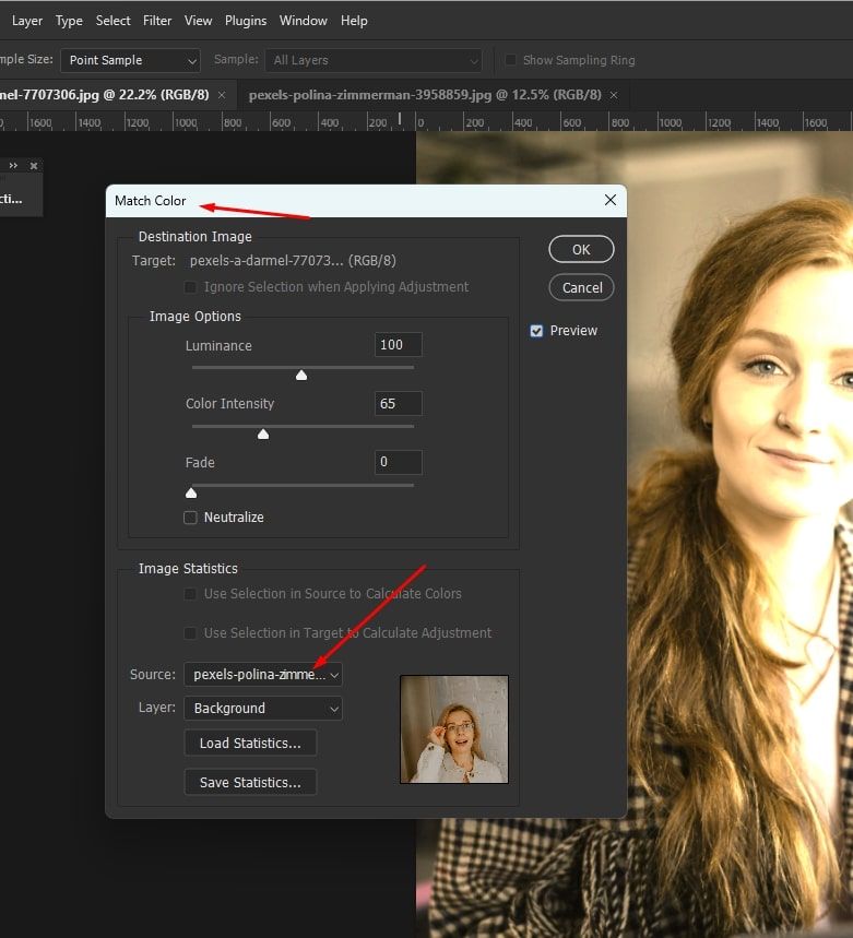
Then, Photoshop analyzes the colors and applies all the corrections needed to make the selected image match the source image's tones and mood.
What is Color Grading in Photoshop?
While color correction is all about fixing colors to be accurate, color grading is way more artistic. It's about using colors to set a certain vibe or feel.
Whereas correction strips the colors back to neutral, grading is all about adding style and personality. You can warm things up to feel cozy, cool them down for a mysterious mood, or turn up the saturation for high-energy colors.
It's less about making colors realistic and more about making them evoke emotions. For example, turning blues colder might set a sad vibe, while popping oranges and yellows says it's a fun, cheerful scene.
Photoshop Color Grading Tutorial
Gradient Map Adjustment
Gradient Maps are fun to play around with if you want to completely recolor a photo in artistic ways.
- First, create a new Adjustment Layer by going to the Layer menu > New Adjustment Layer > Gradient Map.
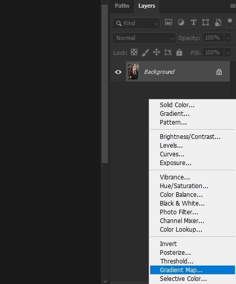
- It'll show you a bunch of preset color scheme options to choose from, like Sunset, Rainbow, etc. But you can also make your own custom gradients if you're feeling extra creative.
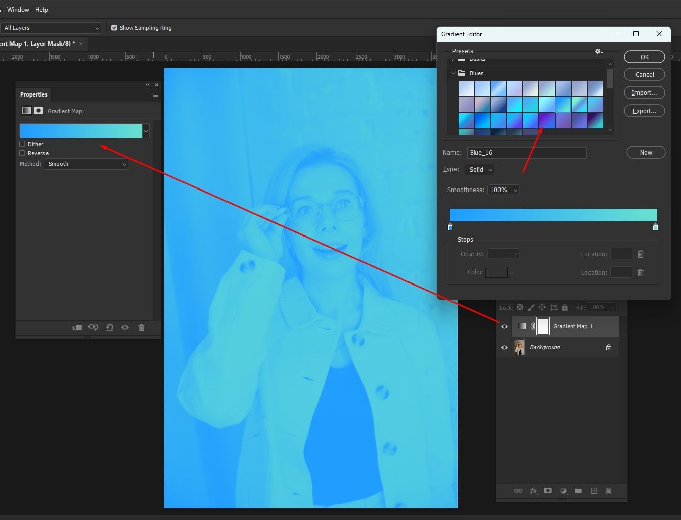
- From there, it's all about blending modes and opacity to your liking.
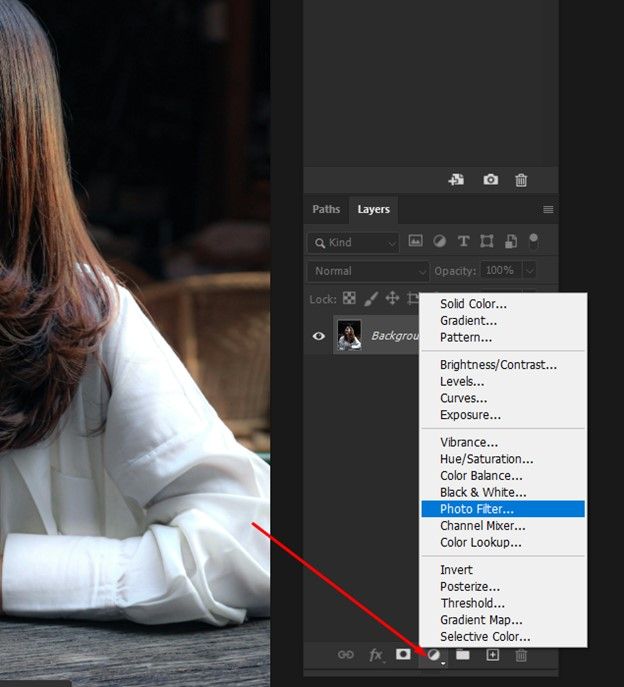
Photo Filter Adjustment
If you have ever used old-school camera filters, the Photo Filter adjustment layer acts pretty similar. You can find it by going to:
- Layer > New Adjustment Layer > Photo Filter.
- From there, it shows a bunch of imitation filter options, such as warming, cooling, blue/orange, etc. You can also make your own custom colors.
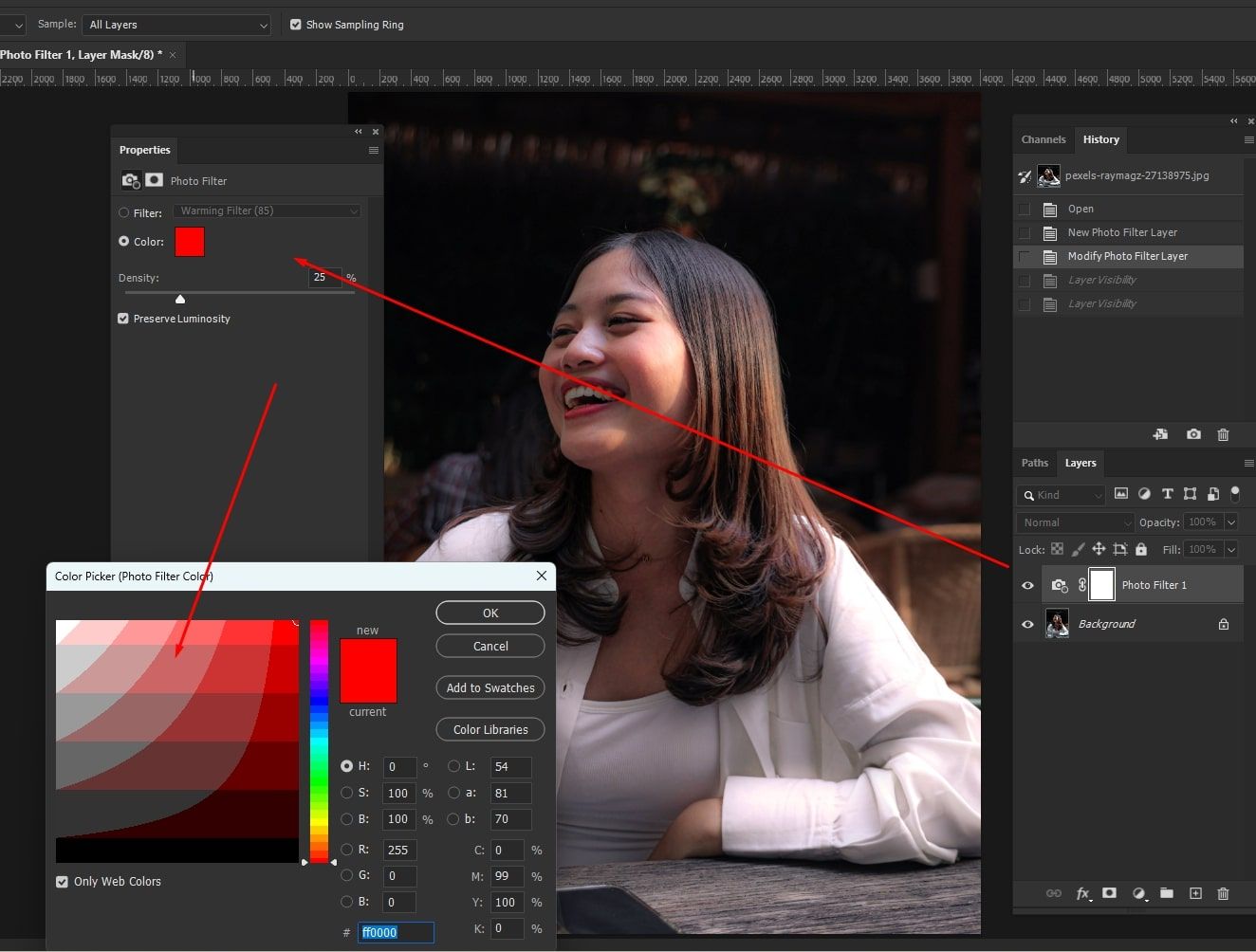
- Once selected, use the Density slider to control how heavily the effect is applied.
Split Toning
Split toning is a fantastic way to give your shadows and highlights unique color vibes.
- Go to Image > Adjustments > Color Balance.
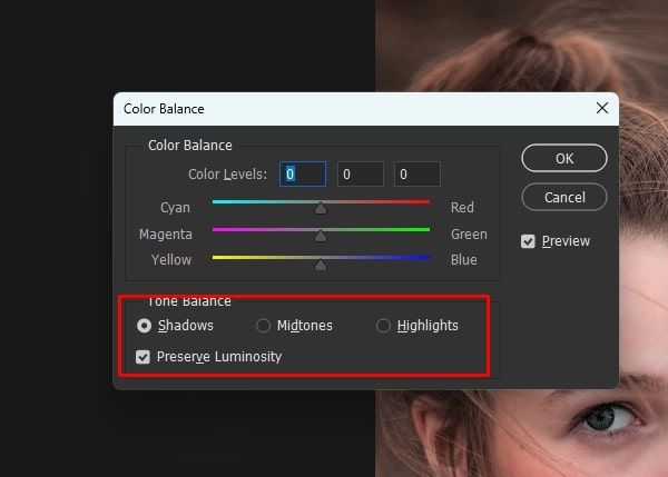
- There, you'll see options for Shadows and Highlights that let you pick colors and tones for each.
- Then, the Balance slider blends between the two so you can control where the split happens.
Creating and Using LUTs
Look-up tables or LUTs let you save and reuse customized color recipes between photos. Here’s how to use them:
- First, pick an image and tweak the colors till you love the look.
- Go to File > Export > Color Lookup Tables to save those adjustments as an LUT file. Name your "recipe" so you remember it.
- To use it later, make a new Adjustment Layer and pick Color Lookup from the list.
- Your saved LUT will be in the dropdown. Once you select it, the colors are injected straight into the new photo.
Step-by-Step Color Grading Process
You can further streamline your color grading process by following this simple step-by-step procedure.
- •Take a minute to think about the vibe you're going for. Look at other photos as references if you need inspiration.
- •Once you know the tone, start broad. You can use the Curves panel to set the base exposure and contrast. From there, you can use the individual color sliders to balance the tones.
- •After that foundation is set, use specific tools for targeting exact hues. You may start with the Hue/Saturation layers to adjust specific color ranges.
- •Then, experiment with the Selective Color tool to make super-fine tweaks to individual ink mixtures. You’ll also want to play around with the Color Balance panel to add character to shadows and highlights separately.
- •Stepping back to check the overall flow is important, too. Making little fixes across multiple layers is usually best.
- •Layer modes and opacity are your best bets for subtly blending it all together. You can also play with masks to make adjustments in specific places.
More Tips for Effective Color Correction and Grading
To help you improve your color correction and grading, here are a few more timeless tips:
- •Always use Adjustment Layers - it lets you easily tweak or remove changes without messing up the original photo.
- •Layer masks are lifesavers for restricting adjustments to just part of an image. Use it to make colors look natural across light and dark areas.
- •Don’t forget to calibrate your screen so that what you see matches what prints and displays elsewhere.
- •If you're working on a series of photos together, be sure to grade them all in a matching way. Saved presets and LUTs really help nail down the same vibes between multiple shots.
Wrapping Up
Perfecting your color correction and grading takes both technical know-how and artistic flare. The more you familiarise yourself with the different tools and methods, the more precisely you can transform your images.
So, feel free to play around. After all, finding your style only comes from experimenting. As long as you keep practicing, your color expertise will grow over time for sure.
And at the time of color correcting, if you see any wrinkles in an image you can fix that if you fillow this.
Written by
Isabella Garcia