Best Background Colors for E-commerce Product Photos
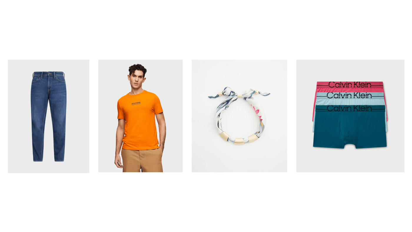
Popular background colors for most eCommerce websites include white, transparent, off-white, and light gray.

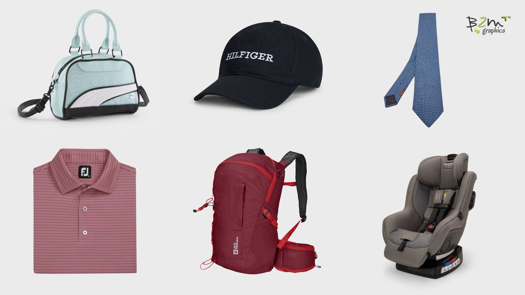
Photo backgrounds are important for making products attractive. It helps draw attention to the item and makes the details clear. This shows your professionalism and helps build trust among the audience.
White is the most widely used background color. It’s easy to highlight the product easily when the background is white. Other common and good options are gray, beige, and off-white. However, you can choose a completely different color for your store but it needs to be consistent and follow a pattern.
With a proper product image background, you can improve customer experience, improve sales, and grow your business. So, keep reading along to get help with your ecommerce product background color.
Examples of Good Background Colors for Products
93% of online shoppers rely on product images to decide whether they would buy a product or not. A good background can highlight the product better, and it must not overpower the product itself. Here are some good examples of background for ecommerce products:
1. White Backgrounds
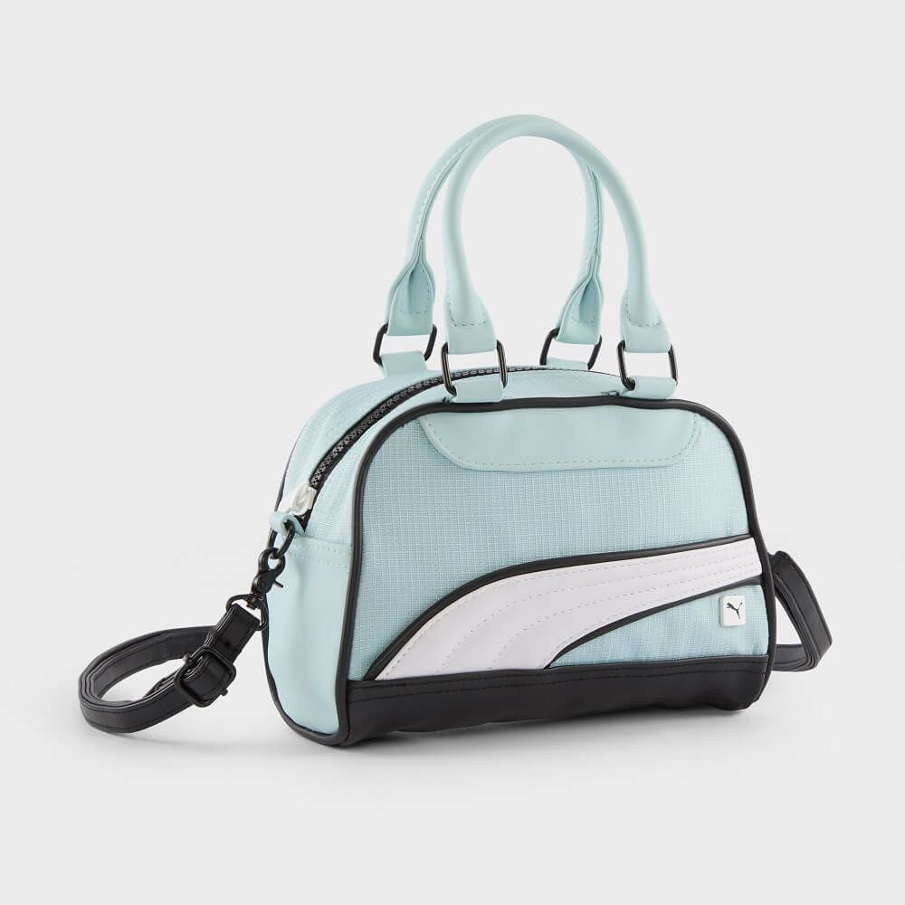
Almost 76% of online product images have white backgrounds. It creates a clean, simple, and professional look. White backgrounds are ideal for e-commerce as they need a clean and focused look on products. This makes it easy to maintain consistency throughout the website.
A white background minimizes distractions and highlights the product. Whether you are selling bags, accessories, or clothes, white suits almost any of them. White color are preferred by major platforms like Amazon.
However, be cautious when using white backgrounds for light-colored products, as they may blend in. Utilize shadows or outlines to create contrast.
2. Gray Backgrounds
Gray is also a versatile background for product images. It offers a neutral tone that keeps the focus on the product. It adds a touch of sophistication without overpowering the item. Gray works well for a wide range of products, including gadgets in different colors as well as products in white.
If you have colorful products, then gray can be an ideal choice to create contrast without being harsh. However, gray may not be the best choice for very dark or dull-colored products. It can make them appear less vibrant.
3. Beige Backgrounds
If you want to create a warm and subtle color that creates a natural and soothing look, beige can be an ideal option. It works best for products like skincare, cosmetics, and handmade items. Beige adds a touch of elegance without drawing attention away from the product.
Beige also works well for items with earthy tones, such as leather goods or wooden accessories. But make sure the color maintains a contrast with the product.
4. Blue Backgrounds

Blue is calming and elegant. It does not take the attention away from the product but adds a sense of elegance. Products like jewelry, gadgets, fitness gear, and healthcare items are ideal for blue backgrounds.
Blue backgrounds also enhance the appearance of metallic, white, and light-colored products. Warm-toned items, such as orange, yellow, or white, stand out against blue.
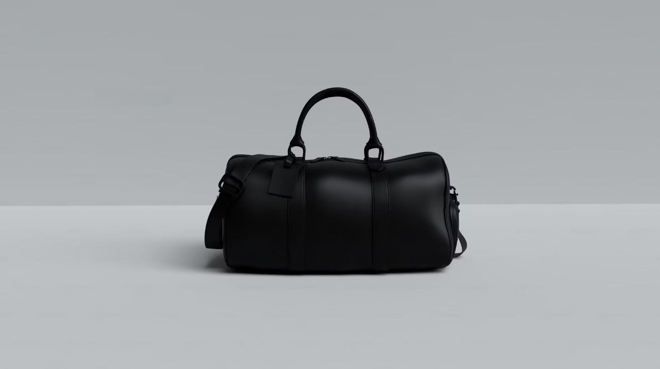
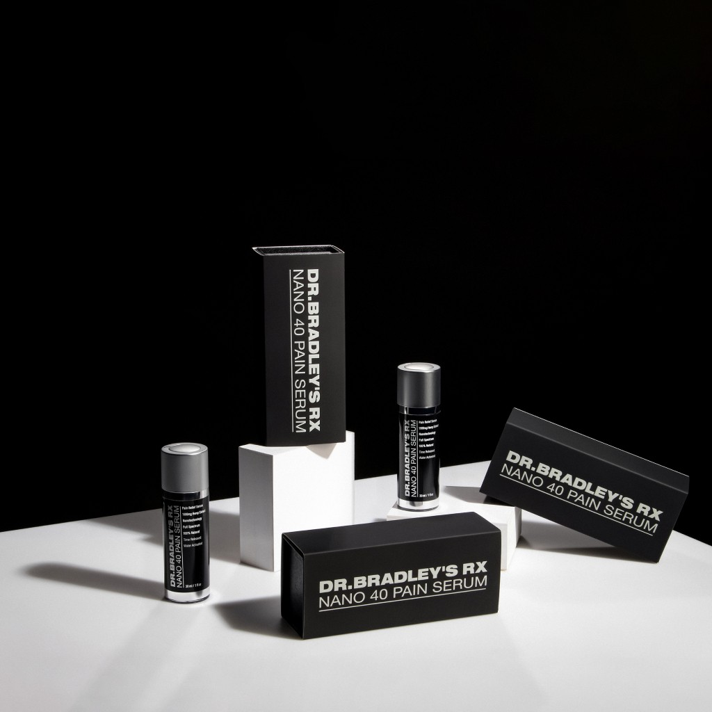
5. Black Backgrounds
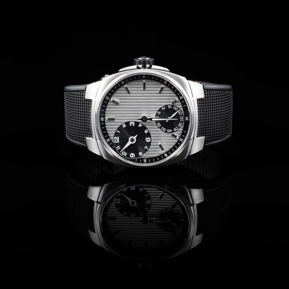
When you need a bold and sophisticated background, black is always a reliable option. It adds a sense of luxury to the product and easily draws attention. The color is ideal for high-end products like jewelry, watches, and premium accessories.
The black background highlights shiny surfaces, such as metals, glass, or polished finishes. It gives the products a striking appearance. This effect draws attention to details and textures. It enhances the overall visual appeal and makes the product look more luxurious.
6. Off-White Backgrounds
If you want to maintain a soft background but make it more contrasting for light-colored products, off-white can be a good choice. It’s ideal for useful lifestyle products and home decor items. Besides, off-white suits any skin-tone-colored model.
7. Red Backgrounds
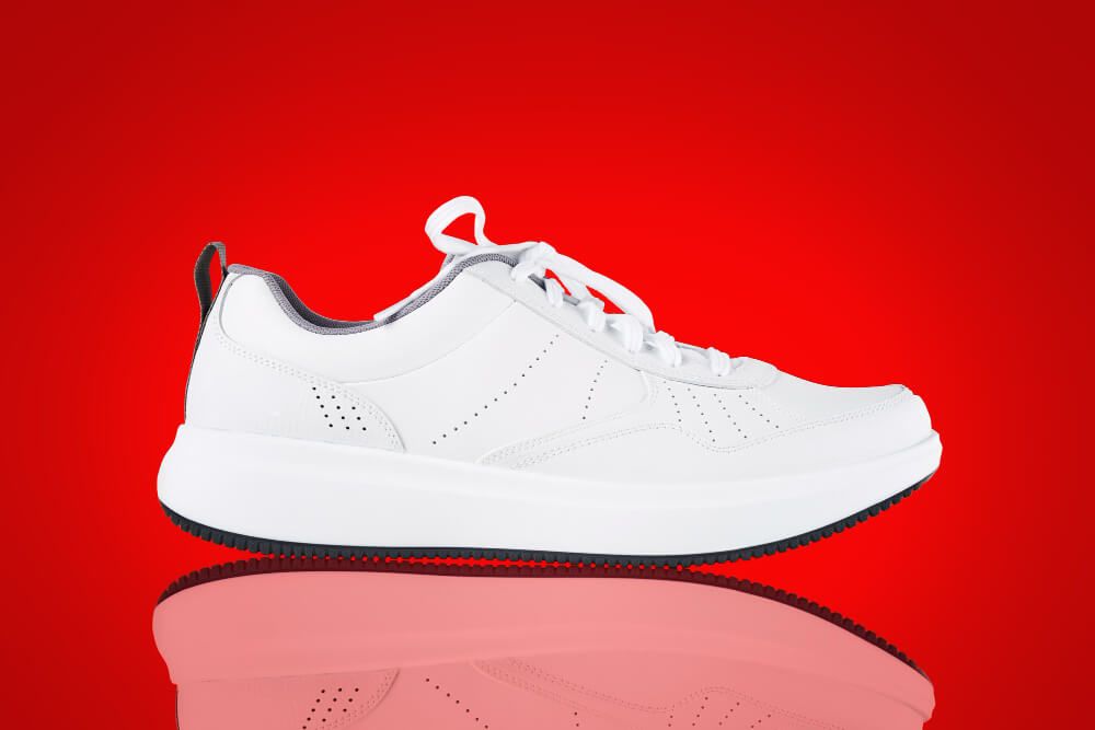
Though not a very popular option, if you want to make a bold statement about the product, then red can be a good background. It’s the perfect color when you want to add some drama and excitement to your product image.
Factors to Consider When Choosing the Product Background
Don’t just go for the easy way. Instead, you have to consider a number of factors at the time of background selection for product photos, such as:
Understanding Color Theory
Understanding color theory is important when you have an ecommerce store. It helps you understand how different colors work together and affect the audience's emotions.
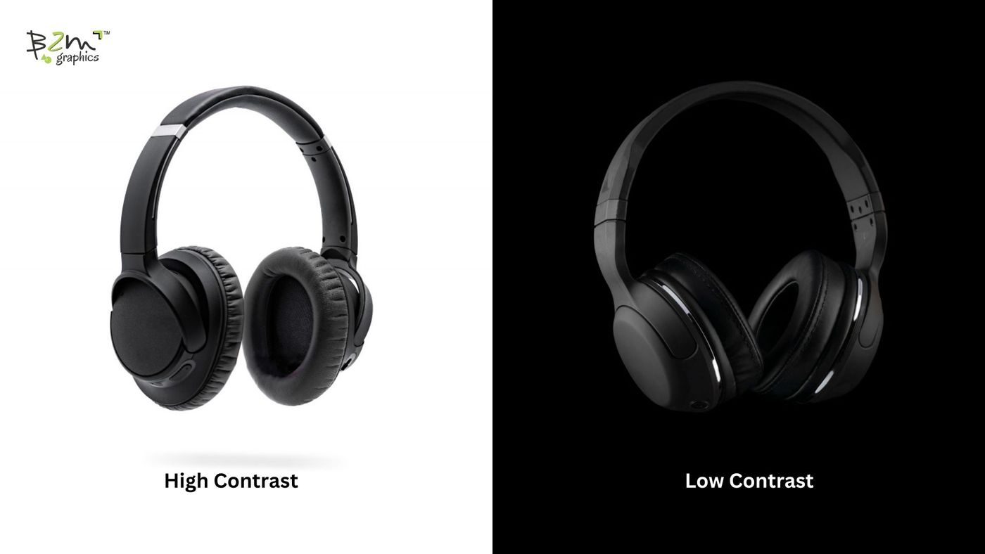
High-contrast color combinations always draw more attention. For example, dark backgrounds with light-colored products or vice-versa can make the products pop. Low contrast creates a subtle look but may not highlight the product well.
Maintaining high contrast is usually better. It helps the product catch the viewer's attention by offering more detail. High contrast also improves visibility, while a low contrast background creates a soft and minimalistic appearance.
The Impact of Consumer Psychology

Colors can influence consumer psychology. Therefore, choosing the right tone for the background is crucial. Color tone is another important factor you need to keep in mind. Color tone refers to the brightness or darkness of a color.
Warm tones, such as red, yellow, and orange, can create warmth and a sense of urgency. You may get more attention from the audience for the products. However, cool tones, like blue, green, and purple, offer a calming or soothing effect. Cool tones are ideal for items related to relaxation or wellness.
Different colors can evoke different emotions in your consumers, such as:
- White: Offers a clean, simple, and modern look when used as background.
- Yellow: Eye-catchy, warmth, and offers clarity.
- Orange: Can create a sense of confidence in your customers.
- Red: Shows excitement but is less effective when used as product background.
- Pink: Often related to romanticism and femininity. You can use it for children and women's products.
- Purple: Offers a soothing color when shopping, though it can affect the presentation of the product if it is not highly contrastive.
- Blue: A serene color that evokes feelings like trust and security in customers.
- Green: It’s the most comfortable color for eyes to process.
- Gray: A balanced color that works with all kinds of products.
- Black: Adds a sense of luxury to the product and easily draws attention.
Aligning with Your Product Type
Image background is often influenced by the product you sell. While neutral backgrounds like white work best for clothes, other items may look best in contrastive or in more vibrant backgrounds.
Jewelry, for example, needs to have a contrasting and elegant background. Using red can offer contrast but won’t give you an elegant look. You had better choose colors like blue or black.
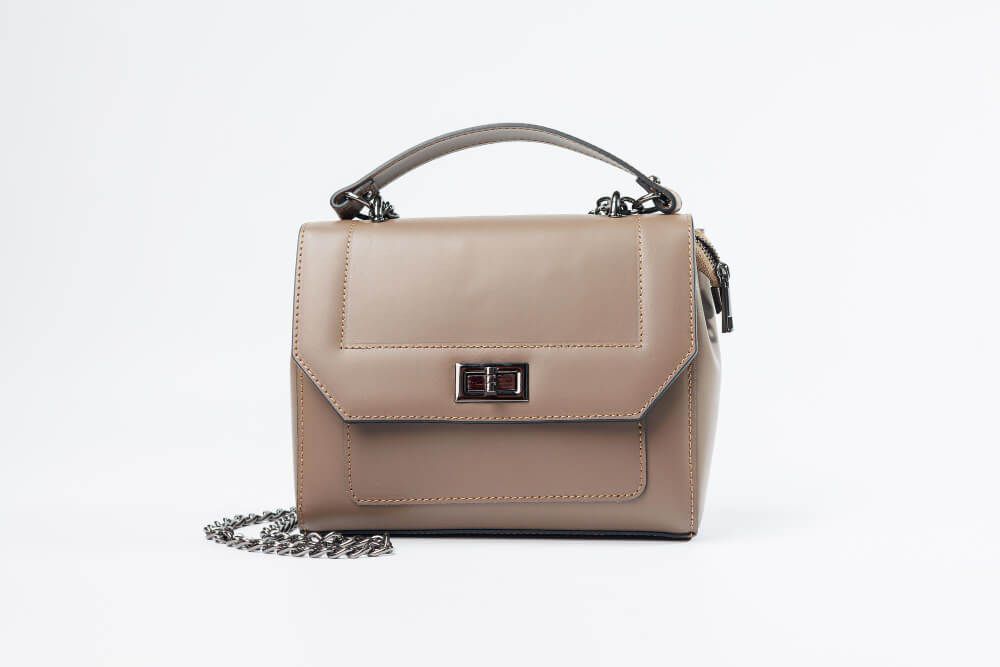
When selling bags, make sure they stand out against the background. But you have more creative freedom with them. Adding neutral or textured backdrops can add depth and luxury to your bags.
Since accessories can be of different colors, they have a contrastive background. This will help the customers see them clearly. For ladies items, opt for soft pastels to add a feminine touch.
If you have shoes, then neutral backgrounds are often the best options. Neutral backgrounds provide a clean canvas that allows the shoe’s design, color, and details to shine.
Adhering to Platform Requirements
When you have your own website for business, you have full creative freedom. You can choose any product background you like. However, when doing business on ecommerce platforms like Amazon, eBay, or others, there are often some restrictions.
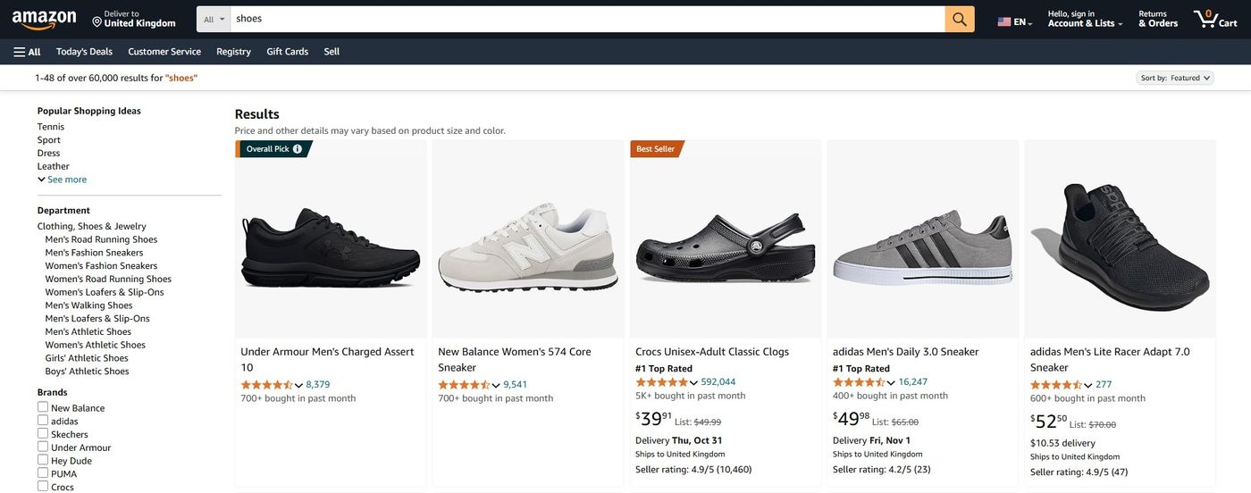
Amazon, for instance, has a must-have requirement for white backgrounds. Whatever products you sell, the primary image must have a white or off-white background. This helps them maintain consistency throughout the marketplace.
So, know your platform properly when choosing backgrounds for product backgrounds.
Consistency with Website Design and Layout
Make sure the product background complements the overall theme of the site. Using a consistent background for product images helps maintain a cohesive look. The best way is to try different backgrounds and see what color complements the website design.
While most website themes go well with white product backgrounds, you can try something more creative. But make sure this does not affect the visibility of the products.
Establishing Visual Hierarchy

When choosing a product background, consider how it affects the overall layout. A strong background should not overpower the product. You need to use contrasting colors to emphasize them. For example, red backgrounds are often overpowering and can take away attention from the actual product. Make sure there is a balance between the background and the product.
Using Contrasting Backgrounds Effectively
It’s not mandatory to always have a single-color background. You can use multiple colors as well. This will help make a more engaging appearance for the products.
However, when using multiple colors, choose combinations that complement each other. Make sure it’s not overpowering the product. Gradients, patterns, or color blocks can add depth and interest. The colors should guide the viewer’s eye towards the product.
Final Words
Having a good background makes your products more appealing. Choose a color that helps you notice the detail of the product. The right color improves the textures and features. Maintain contrast and avoid overly busy or distracting backgrounds to maintain visibility.
Understanding How to Change Background Color in Photoshop can also help in creating compelling product images.
Written by
Isabella Garcia